America’s 10 worst airport websites: No.6 – McCarran International Airport
McCarran International Airport (read our review) is the main airport of Las Vegas. It’s a huge airport and one of the busiest airports in the world when it comes to passengers.
McCarran International Airport‘s mission statement is “To provide excellence in customer service and airport facilities.”
To that end there are more than 1,200 slot machines throughout McCarran International Airport’s terminals and fewer than 155 words on accessibility, ADA, wheelchairs, special needs, disability services and all that, throughout their official website.
Seriously!
However, the insultingly few words on their accessibility services and facilities alone would not have been enough to get McCarran International Airport’s website into our prestigious America’s 10 worst airport websites list.
Apparently there are a lot more bad points in their website, which is shocking considering the size and importance of McCarran International Airport.
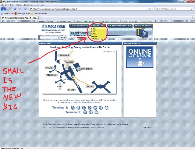
First of all it seems to me that the site is designed for small (typically manufactured before 1998) computer screens or for people with 20/20 eyesight.
There is a lot of blank space around the web page and the fonts are ridiculously small.
Sure, the site would’ve looked (half) decent in 640×480 resolution, but I think whoever designed their website is more than a decade late!
On the other hand if I am wrong and the website is designed that way to be accessible through mobile phones then why they did not bother making two versions, one for computers and one for handheld devices? There’s no excuse, I think!
Also, for some reason it seemed to me that throughout the site only advertisements had a reasonable font size.
In case you want to see for yourself, visit their official website here and browse around: http://www.mccarran.com/
Below is a screenshot of the website showing the small fonts and size of the page body. Notice all that blank space around the main body – I wonder how much useful information could fit in there:

What’s probably worst though is how hard it is to find their accessibility info (yeah, all 154 words of it).
Not only is it a nightmare to browse their entire website with its tiny fonts trying to figure out where to look for accessibility info, but what little accessibility information there is (a few brief listings) is only accessible through an interactive airport map. The map itself is notoriously hard to navigate, includes no map signs as to where one can find the airport’s elusive accessibility facilities, and lists those facilities among dozens of other unrelated services and facilities such as ATMs, free Wi-Fi and slot machines (we’re in Vegas, don’t forget!).
Actually it’s so hard to find the accessibility info on McCarran International Airport‘s website that we could make a game out of it!
The McCarran International Airport Website Accessibility Info Blitz!
So here are the rules:
Visit http://www.mccarran.com/ and try to find all the accessibility information in their website as fast as you can!
I challenge you!
You can post your time and what you actually found below!
(It took me 21 minutes to find their accessibility information, can you beat my time? :P)
(A direct link to the airport’s interactive map can be found at the bottom of this article.)
All in all, I think McCarran International Airport‘s website underdelivers at the first part of the airport’s mission statement: “To provide excellence in customer service and airport facilities”
Well then, here’s an overview of what makes McCarran International Airport‘s website bad enough, in my opinion, to be included in America’s 10 worst airport websites:
- No dedicated accessibility or special services page.
- Depressingly little accessibility information (154 words!)
- No direct link and no indication as to where the airport’s accessibility info can be found.
- Accessibility information only available through the mindboggling interactive airport map along with a lot of unrelated information.
- The lack of a site map makes browsing for the information you need harder.
- Tiny fonts used throughout the website make it even harder to navigate.
(You can visit their interactive airport map here.
You can also use it to cheat at “The McCarran International Airport Website Accessibility Info Blitz!” above if you get stuck 😛 )
This is No.6 in our America’s 10 worst airport websites series
